30 November 2005

It's time to move away from presentation mode

Presentations need an overhaul. I don't mean your PowerPoint or your presentation style; I mean our cultural approach to presenting. We need to take another look at it.

Question: What is the purpose of the presentation?

The overt purpose is to educate and inform

The covert purpose is to reinforce the status of the expert and remind the audience that they are not competent to solve their own problems.

I submit that in the information age the traditional presentation model needs to change from

presenter>audience to

host<>guests.

Ideas don't evolve in a vaccuum and they don't generally flow in one direction.

Our current paradigm is based on a preacher model. An authority figure stands at the front of the room and lectures the class for forty minutes and then takes questions from the audience. Presentation styles vary but more or less they all follow this model.

Nearly every one of XPLANE's customers already has the expertise they need to solve their problems. They don't need more experts in the traditional sense -- they need people who can help them find, develop and share the best practices and experts within their own organizations. They don't need more wizards and consultants; they need to improve their communication flows.

We need fewer presentations and more conversations.

We need to develop new approaches that allow the group to take on a greater role in the knowledge-sharing experience. Approaches that turn the traditional presenter into the host of a knowledge-sharing event, rather than an expert spouting wisdom.

At XPLANE, we are working on some experiments in conversation, in an attempt to flesh out some new mechanisms for unleashing the knowledge and creativity of groups. We have already identified some interesting patterns and structures that have lead to powerful results. If your organization would like to host one, please let me know and we can try to design one together.

Please share your thoughts.

Keep in touch! Sign up to get updates and occasional emails from me.

28 November 2005

Lines of communication

In war, the first thing an army will attack is the enemy's lines of
communication. Why? Because success depends on people, who can only act on information they have received and understood.

The Internet was originally developed to enable rapid and reliable communication in times of war. Ironically, the resulting improvements in information flow have also spawned a fog of confusion. The volume of information that’s now available leaves many people overwhelmed, stressed and confused.

Advances in technology and genetics continue to change the business landscape in dramatic ways. There will be winners and losers, and businesses who can rapidly deploy understanding to their extended value chain — both inside and outside their “four walls” — will win.

Click here to download Lines of Communication, a visual map of the complex information flows within a typical large enterprise, courtesy of your friends at XPLANE.

Keep in touch! Sign up to get updates and occasional emails from me.

27 November 2005

What is information design?

There are as many definitions of information design as there are information designers. Some think it's the presentation of complex or potentially confusing information. Others see it as a method to visualize quantitative data. In the end it comes down to how you define information and what you mean by design.

Here are my definitions:

Information: Anything that people need to be aware of in order to make better decisions. For example, the weather report, a new workplace policy, when your taxes are due, etc.

Design: The discipline of developing structures which enhance people's lives. For example, a well-designed house, website or newsletter improves your quality of life more than one that is poorly-designed.

So if you can agree with those definitions, a good definition for information design might be:

Information design: The discipline of developing structures which allow people to find information that's relevant to them, and use it to make decisions which enhance their lives.

This sounds simple when you say it that way, but it has broad implications to a field that most people think of as "the chart people." It's a broad role that crosses organizational silos and goes straight to the heart of what is essential. It includes things like interface design, meeting design, and standards for organization-wide communication.

There is a role in many organizations that is well-suited to owning the information design agenda: and that's the CIO or Chief Information Officer. Developing and sustaining the structure that supports good information flows requires attention to technology, culture, management, and even the simple daily habits and behaviors that rule our organizational lives, such as how we use email and how we run meetings.

Message to the CIO: Step up to the plate!

In a recent web post, Mel Chua made some great points on the subject:

Data continues to burgeon, and we're totally unprepared as a society to handle it. We need a thinking shift. I'm not sure I would call it knowledge management, if by knowledge management we mean "Look, lots of data - store it." We need design (product, software, analysis techniques, whatever) that's geared towards

(1) communication and

(2) organization/productivity.

How do we make use of massive streams of data while still getting things done? We can't shut the doors and say"we can't deal with this much input, so we'll ignore its existence." We can't go "All right, let 'er in!" and then drown in overload. There is too much to do; there is too little time and too few people.

Forget motivational speakers and their exhortations to "take charge of your life" and "get organized." We know all that stuff. We roll our eyes at it. Our work habits are still a mess. It's like the couch potato that knows he should hop off his bum, stop eating TV dinners, and exercise. And yet he doesn't. How can he create a plan so he will? This is an information design problem.

Or you're presenting your new project at a conference ... How do you manage your slides, your speech, your lighting, your talk - how do you get your audience engaged and engrossed in your concept? Numbing their brains with powerpoint bullets is not the right solution, but what is? This is an information design problem.

You want to explain a process ... You want it on a poster you can tack to the wall, but there's so much data to abstract. You don't want a gigantic text dump, but at the same time, a big unlabeled triangle doesn't really tell you much... how do you make content concise yet intuitive, simple yet full of meaning? This is an information design problem.

You're working with a software team. Bug reports and revisions are flying through the air. How do you hold it all together? How do you share information, delegate tasks, ask questions, talk to one another, keep the wheels turning smoothly - what makes a good team good, and what can bad teams do to get better (or is all hope lost for certain group dynamics?) Where do you store what you know? This isn't just a matter of what variable name in what database on what server; this is also things like "Betty's our resident skateboarding expert, but Dan is really good at giving speeches" that nobody ever writes down ... How do you formally describe this so you can make the process better? This is an information design problem.

[Read more from Mel in Information Design: A new discipline?]

I don't agree with Mel that information design is a new discipline, but it's clearly an evolving discipline. "CIO" is a newly defined role, and like "Information Designer," it means different things to different people. There are many definitions, and in some ways they are all correct. But I agree with Mel that most definitions seem too narrow to achieve their stated aim.

The roles came into being to meet a real need. People are overwhelmed with information -- so much so that they increasingly tend to shut down, to filter out key information from the world around them. This is a trend that's dangerous, both for people and the companies where they work.

If we are going to help people cope with the arrival of the information society, where information can be delivered "any time, any place, anywhere," then information design needs to stake a larger claim in the corporate world. Information design must rise to the challenge, to rescue us from the increasingly tangled complexity we are collaboratively creating.

Keep in touch! Sign up to get updates and occasional emails from me.

26 November 2005

The beauty of simplicity

"It is innovation's biggest paradox: We demand more and more from the stuff in our lives--more features, more function, more power--and yet we also increasingly demand that it be easy to use. And, in an Escher-like twist, the technology that's simplest to use is also, often, the most difficult to create. "

Read more in The Beauty of Simplicity

Keep in touch! Sign up to get updates and occasional emails from me.

Is better what you think it is?

If you think it's better, then it is.

That sounds pretty obvious, doesn't it? But wait a second; that's so subjective. Isn't "better" something you can measure? Can't you test for quality, survey people about their preferences, measure against benchmarks?

Sure you can. By all means, test quality, measure it as best you can. But don't labor under the illusion that being the best will lead you to victory.

But think about it this way:

Pepsi won the taste test, Coke won the war
Apple had the best operating system, Microsoft won the war
And take a guess... what's the best search engine?

Are you sure?

Do you know what the survey said?

Keep in touch! Sign up to get updates and occasional emails from me.

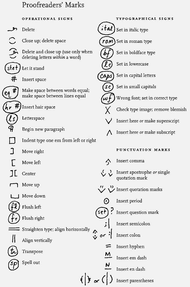
Proofreading

Even if you're not a professional copy editor, you may be asked to check someone else's writing or read it and comment. If you're going to mark up someone else's copy, it's a good idea to know how the professionals do it: over the years they have developed excellent standards.

Here's a summary.

More at Chicago Manual of Style: Chicago Manual of Style - Tools - Proofreading

[Update: Here are some lesser-known proofreader marks from Geist, courtesy of Neil at beatnikpad (I have a feeling these might more fully express the emotions of copy editors I have known in my journalism career). Thanks Neil!]

Keep in touch! Sign up to get updates and occasional emails from me.

How to be happier

Lifehack offers 9 life tips for happiness:

1. Understand what it is that will make you happy.

2. Make a plan for attaining goals that you believe will make you happy.

3. Surround yourself with happy people.

4. When something goes wrong try to figure out a solution instead of wallowing in self pity.

5. Spend a few minutes each day thinking about the things that make you happy.

6. Take some time each day to do something nice for yourself.

7. Find the humor in situations that would otherwise make you unhappy.

8. Maintain your health by eating right and exercising.

9. Believe that you deserve happiness.

Read more in lifehack.org: 9 Tips in Life that Lead to Happiness

Keep in touch! Sign up to get updates and occasional emails from me.

Schedule meetings easily online

MeetWithApproval.com:

"Arrange a meeting or event. Work out which day is good for everyone & keep track of who is coming. Meet With Approval' could not be simpler. Fill out the form which creates a meeting page. Your friends or colleagues are notified of the event. They visit the meeting page and help decide a good date. When you are all happy, 'Meet With Approval' confirms the arrangement and you all meet up.

Best of all it's FREE!"

Keep in touch! Sign up to get updates and occasional emails from me.

25 November 2005

What makes a great presentation?

Here's a great thread on how to improve your presentations, from 43folders.

Keep in touch! Sign up to get updates and occasional emails from me.

Group brainstorming with index cards

Douglas Johnston, creator of the DIY planner has a great method for group brainstorming with index cards. Douglas says he's used the process several times to good effect.

It's designed to ensure that a broad range of ideas is collected in the shortest possible time.

Here's how it works:

1. Set your group or team around a table. Give each one a stack of index cards. The problem or issue at hand is explained by the facilitator. If people want to discuss their ideas, stop them. (This may not be easy.) The important thing is not to "taint" their creativity with only one or two threads that might stifle new ideas.

2. In relative silence, each person takes a card and writes down one idea. He or she then passes the card to the person on the right.

3. That person reads the card and uses it to generate a new idea. He or she then turns the first card upside down in a stack, and passes the new card to the right.

4. The process of writing new ideas and passing to the person on the right continues for a set amount of time, perhaps ten minutes.

5. At the end, the facilitator gathers the cards. Each idea is read alound, and the cards are then arranged and grouped on a whiteboard or wall, with duplicates discarded. This is used to stimulate discussion or more ideas, preferably on another whiteboard or some mind-mapping software on a projector.

Thanks Douglas!

Keep in touch! Sign up to get updates and occasional emails from me.

The Ultimate Guide to Google Services

Keep in touch! Sign up to get updates and occasional emails from me.

The world's largest online brain

My friend Jerry Michalski of Sociate has the world's largest personal online brain. It's a fascinating romp through theories of everything, isms, management theory, conversations about change, and much more. You could easily get lost in Jerry's brain.

Keep in touch! Sign up to get updates and occasional emails from me.

Paper magic

Keep in touch! Sign up to get updates and occasional emails from me.

Warning Label Generator

Make your own at Warning Label Generator

Keep in touch! Sign up to get updates and occasional emails from me.

24 November 2005

The corporate hip-hop presentation style

Dick Hardt of Sxip completely captivates his audience with great visuals, great storytelling, and great timing. His presentation has a staccato, rhythmic quality, like a kind of corporate hip-hop.

And he pulls it off by focusing your attention on the screen; he barely moves a muscle and doesn't budge from behind the podium. One benefit of this presentation style is that it transfers seamlessly to the web.

Clearly he practiced his talk; it went like a well-oiled machine. If you want to try this style you'll need to practice several times to get it down.

Erick Gockel points out that the style is derived from Lawrence Lessig's approach to presentations, sometimes called the Lessig method. I agree with Eric, but I also think that Dick is building on that approach and taking it new places.

Take a look.

Keep in touch! Sign up to get updates and occasional emails from me.