31 December 2005

Landscape in progress

Version 1.0

Version 2.0

Version 3.0


I am not sure where this is going but it's not there yet. Funny, it's a tiny painting (5 x 7 inches) and it's giving me a lot of trouble. Keeping me up at night even.

[Update. In the morning light I decided I liked it. Made a couple of tiny tweaks but I decided it's done.]

Version 4.0

R & R

I'm going to do some painting over the holiday week -- I'll be posting sketches and paintings instead of the usual posts for a few days.
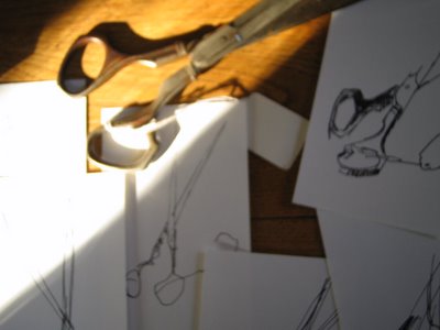
Landscape fragments from along the interstate, along with some painting plans. More sketches here.

Painting in progress.

Let me know what you think -- your thoughts and comments are most definitely invited.

26 December 2005

The probabilistic age

Q: Why are people so uncomfortable with Wikipedia? And Google? And, well, that whole blog thing?

A: Because these systems operate on the alien logic of probabilistic statistics, which sacrifices perfection at the microscale for optimization at the macroscale.

Q: Huh?"

Read on for enlightenment.

(Thanks Richard!)

25 December 2005

A letter to Friendster

Dear Friendster,

We used to be close, but somehow over the last year or so we have just grown apart.

And then there's these emails you keep sending me:
"Dave, Friendster misses you"
"Dave, Friendster really misses you"
"Dave, check out the all new Friendster"

Well, I have. I have checked out the all new Friendster. And, well, maybe we can be friends some day, but for now it feels a little like you're stalking me.

So I'm breaking up with you.

We had some good times but it's over. Someday if I'm ready to be friends again I will let you know. In the meantime please don't call or write.

Sincerely,

Dave

24 December 2005

Visual thinking practice: Body language

Your body language conveys more than you may be aware. Whether you are happy or cranky, you broadcast your emotions by the way that you sit, stand and move. Your level of enthusiasm and participation in any group activity is easy to gauge, even from a distance.

Visual thinking is about using pictures to enhance your ability to solve problems, think about complex issues and communicate effectively. Are you ready to work on your visual thinking skills? You don't have to be an artist. Pick up a pen or pencil and try the following exercise.

1. Find a public place where people tend to congregate, like a plaza, shopping center, cafe or bar.

2. Take note of peoples' body language, and see if you can capture the essence of their emotion by drawing simple stick figures.

3. Limiting yourself to simple stick figures will help you focus on gesture and pose, rather than getting caught up in the details.

Doing this will improve your skills of observation, improve your sketching skills, and also fine-tune your ability to "read" the body language of others.

Read more about visual communication in visual thinking school.

Noguchi + transparency = productivity!

Dave Mohrman had some ideas for enhancing the Noguchi filing system I wrote about last week.

At my request he took some photos and wrote up a brief description of his method. Take a look.

Thanks Dave!

22 December 2005

Visual thinking practice: Finding your visual voice

Finding a personal voice is about discovering what is unique to you. It's one of the things that makes you sincere, meaningful and worth listening to. Companies struggle with this as much as individuals. Which companies have a unique and personal voice? You know who they are:

- Volkswagen
- Apple
- Southwest Airlines

I'm sure you could name several more.

Visual thinking is the practice of using pictures to enhance your ability to solve problems, think about complex issues and communicate effectively. Are you ready to work on your visual thinking skills? You don't have to be an artist. Pick up a pen or pencil and try the following exercise:

Find your visual voice
Your visual voice is that intangible which makes your sketches, doodles, and whiteboard scribbles uniquely yours and no one else's. You could think of it as your visual signature. Here's a way to discover it.

This exercise will require a bit of time. You'll need an hour or two to complete it, and to be effective it needs to be done in one sitting.

1. Find an object that's visually interesting to you; something you wouldn't mind spending some time with. It could be big or small -- anything from a water tower to a stapler. The only rule is that you need to be able to observe it from life.

2. Get a pen and a stack of 100 index cards.

3. Now draw the object 100 times -- that's right, 100 times -- once on each card. It's important to do this in one sitting no matter how long it takes. Part of the exercise is to discover things that will only reveal themselves if you are bored or tired. In the corner, number each card from 1 to 100 as you go.

4. When you are done, put the cards away and don't look at them till the next day.

5. The next day, spread the cards out on a table, floor or other large surface. Take a few minutes to digest what you see. What themes or patterns emerge? As friend to arrange them in groups and put similar drawings in clusters or groups. You will have a few favorites. Ask yourself,
- Why do you like them?
- What do they have in common?

This kind of exploration works because the sheer volume of work breaks down any artifice or pretense and exposes your natural voice in its purest form.

Please share your favorites in the visual thinking school Flickr group.

21 December 2005

The visual thinking club

Visual thinking school is gaining in popularity -- it's number 13 in the top 100 at Seth Godin's new online community, Squidoo.

I created a blog so everyone interested in visual thinking can share their projects, pictures, thoughts and ideas. It's a place where people can post images, ask for feedback and comments, post thoughts and ideas, etc.

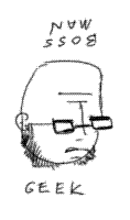
The image shown here is a bossman/geek drawing by Chris Brogan.

I also set up a Flickr group to share images, which will be visible on the blog via a Flickr badge.

If you want the "power to post" in the visual thinking group blog, just send me an email at dgray (at) xplane.com and I'll add you as a member.

Please join the visual thinking group blog and the Flickr group. I can't wait to see what develops.

Join us!

The M curve

Interesting post from Noah Brier:

"For anyone who has ever been involved in a brainstorm, or just been trying to figure out a problem, you know about how there's always that low point. It's normally the time when everyone has come up with a bunch of good ideas and it doesn't seem like there are many other interesting places to go. Often brainstorms even end at this point. However, as I learned while having a drink with a friend of mine currently getting his MBA, if you push through that valley of ideas you will see another, even more fruitful peak. That's when the really great ideas come out. The innovative ideas."

20 December 2005

The Noguchi filing system

The filing system proposed and used by Noguchi Yukio is worth a look. To employ the system, you'll need to discard many conventional notions about how to store paper documents. Here's how it works:

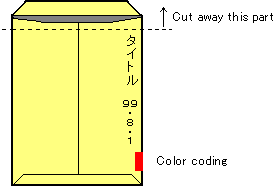
You need a set of A4 (letter)-sized envelopes and some way to mark the outside of the envelopes. If you want, you can color-code them with markers.

Take every document and store it in an A4-sized envelope with the flaps cut off, as shown here.

Mark the title and date of the document on the side of the envelope, as shown, and the envelopes are stored vertically on a bookshelf.

Don't attempt to classify documents. The color coding is optional, and only there to help you find documents more quickly.

Add any new document to the left end of the "envelope buffer." Whenever a document is used (i.e., the envelope removed from the shelf), return it to the left end of the bookshelf. The result of this system is that the most recent and frequently used documents move to the left, while documents that are rarely or never used migrate to the right.

Over time, some of the files on the right side of the shelf will be classified as "holy files" which you will retain indefinitely. Remove these from the shelf and store them in boxes. If a "holy file" is in use, it is part of the working file group at the left. Thus, holy files are really dead files which you cannot part with. Get them out of sight into a box.

When you need more space, throw away any documents that you consider "unnecessary."

Read more on Noguchi's system in this article by William Lise, or on Noguchi's website.

19 December 2005

Visual thinking practice: Bossman/Geek

Visual thinking is the practice of using pictures to enhance your ability to solve problems, think about complex issues and communicate effectively. Are you ready to work on your visual thinking skills? You don't have to be an artist. Pick up a pen or pencil and try the following exercise:

Can you capture the dichotomy of your corporate culture in one picture?

Today's visual thinking practice will give you a chance to improve your visual thinking skills and simultaneously highlight the cultural gap between bosses and geeks. You'll amuse yourself and amaze your friends! Plus it's fun.

The game is called bossman/geek.

1. Get a pen and paper (better yet, buy a sketchbook).

2. The trick is to draw a cartoon picture of a head that reads as a boss character. Sounds simple but here's the rub: when you turn the page upside-down, it needs to read as a geek.

Have fun!

Courtesy of visual thinking school.

Update: Attention last-minute holiday shoppers!

I made up some bossman/Geek stickers, buttons and magnets. You can even buy the buttons in 10-packs and 100-packs so you can give them out to all your friends and co-workers.

Send me your bossman/geek doodles and I'll make more buttons out of them.

Are you bossman or geek? With a button like this you can change your mind whenever you want, just by turning your button upside down.

Another update: I have created a Flickr group where we can post creations and also a discussion blog, where we can discuss visual thinking.

Visual mapping

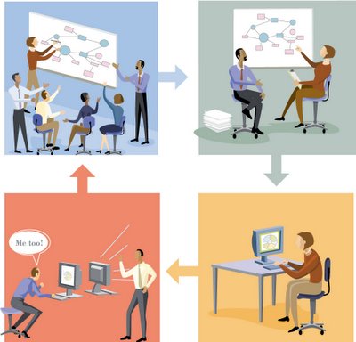
Visual mapping is a way to think through complex issues or solve problems that has several benefits:

1. It makes it easier to work creatively and collaboratively with a group.

2. It's non-linear, so you can work out complex hierarchies and relationships.

3. It allows you to see a whole issue, problem or plan, in its entirety and at a glance.

4. It helps you see patterns, relationships and dependencies that might otherwise remain hidden.

Read more in visual thinking school.

18 December 2005

How to trick out your sketchbook

Three clever ways to make your sketchbook more functional.

1. Add a pencil/pen holder

2. Add some sticky page-markers

3. Add a home-made pencil sharpener

Here's how to do it.

17 December 2005

Visual thinking practice: Draw a stick figure

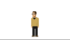
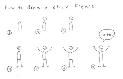
Cliff Atkinson asked if I would show how to draw a stick figure, so I decided to let you in on a little trade secret: All stick figures are not created equal. Today I'm going to teach you to draw a stick figure the way we do it at XPLANE.

Stick figures are a quick and easy way to visually represent the human body doing just about anything. I'm going to start you off easy by showing you how to draw a simple standing figure.

Here's a larger image of the drawing above.

1. Most people start a stick figure by drawing the head. This is a mistake. Since a stick figure represents the whole person, the best way to draw it is the way you see a whole person. Think about what you notice first when seeing someone from a distance. Always start with the body. The body is the center of gravity and motion. By starting with the body you will capture the essence of the gesture you want to convey.

2. After you have drawn the body in the position that you want, draw in a circle for the head. The placement of the head in relation to the body is essential. Happiness, angst, speed and sluggishness can all be conveyed by the relative positions of the head and body. Observe people doing their daily routines and you'll see what I mean.

3. Next, draw the facial expression. Your basic smiley face or frowney face will work here just fine. Adding a little line for a nose will help you show which direction the head is pointing. This can be especially important when you want to show two people interacting with each other.

4. Add the legs next -- they are more essential to conveying the gesture than the arms. When my basketball coach taught me to shoot, he explained that the primary energy that propels the ball comes not from your arms but from your legs (Watch some basketball on TV and you can actually see this). The energy of a stick figure works the same way. Note the use of small ovals to represent feet. This helps connect the person to the imaginary ground.

5. Now draw the arms, and complete the gesture you started with the legs.

6. I made the hands a separate step so you could see what a difference a couple of little lines makes. A short, one-line stroke will suffice for nearly any gesture.

7. Of course you're drawing the stick figure to convey some idea, action or emotion. Thought bubbles and word balloons are a great way to round out the complete thought.

Now that you've drawn a standing person, try your hand at some more tricky problems:
- How would you draw a tall person? A fat person? Someone with long hair or a beard?
- Go to a public place and see if you can capture the gestures of the people around you in stick-figure drawings. This is a great way to hone your observation skills.
- See if you can draw people running, dancing, fighting and sitting.
- Here's a hard one: draw a stick figure riding a bike.

Please send me your drawings so I can share your successes!

Read more about sketching in visual thinking school.

16 December 2005

Information design

Added another module to visual thinking school today:

Technological advances have an unintended consequence: while in many ways they make things easier, in other ways they make things more complicated and difficult to understand.

Information design is an emerging discipline focused on simplifying complexity through order and synthesis.

Read on.

Are people receiving what you are transmitting?

Chris Brogan makes some great points on the difference between message sent and message received.

He also offers some good questions to ask yourself before you communicate:

- Is this a conversation or an announcement?
- What is the message? (or your initial position, if a conversation)
- Is it clear, simple, easy to convey?
- Who is your audience?
- What are they bringing with them? (Are they biased? Preoccupied?)
- What are their motives? What do they want out of this interaction?
- Does your message have easy 'handles,' so that they can carry it away with them?
- How will you be sure they take the message with them when they go? "

Read more in Communication is About BEING UNDERSTOOD

15 December 2005

Icons from around the globe

A blog focused on collecting visual icons from signs around the world: iconglobe

14 December 2005

Just draw a triangle

"People think in threes."

This point is confirmed by recent research on short-term memory as well as Barbara Minto's Pyramid Principle work. In addition I have always found the "rule of threes" to be a helpful concept for simplifying and clarifying any communcation.

Watch Account Planner Russell Davies explain how drawing a triangle can solve any communication problem in the universe.

13 December 2005

What If...

What if your life had gone differently? What if you made an infographic of the ways it could have gone? What if you could map the possibilities for your future? What If...

Link via the inimitable Paul Nixon.

Learn how to read and write Japanese smileys


(^^)
(smiling)
(*^_^*)
(blushing while smiling)
\(^o^)/
(WOW!)
(>_<)
(ouch!)

12 December 2005

Visual vocabulary

Vocabulary is the set of words that make up a language. Words are the fundamental, atomic units which make language possible.Visual language, like written and spoken language, has developed over time.

Your visual vocabulary is the set of elements, or visual "words" that make visual language possible.The greater your vocabulary, the greater your capacity to think and communicate.This module describes the basic building blocks of a visual vocabulary.

Take a look.

Visual thinking school

Joshua Jeffryes' Graphic Design lens inspired me to put visual thinking school on the web:

Visual thinking is about using pictures to solve problems, think about complex issues and communicate more effectively. Are you ready to work on your visual thinking skills? You don't have to be an artist.

The site will be different every time you visit. It's continuously updated via live feeds from the web to bring you the best and most delicious images and links available: visuals to inspire, examples to follow, books to read and things to do, designed to stimulate your imagination and visual thinking.

Update: I got some comments that visual thinking school was content-rich but hard to navigate. Based on the feedback I've decided to roll out one section at a time. Here's the first mini-course.

If you have thoughts or ideas please leave a comment on this post. In the next week or two I will be layering in some hierarchy and structure.

11 December 2005

Windows

The eyes are the windows to the soul. You could also see them as the windows through which the soul sees the world. A window is an opening; a space between two spaces. Jaime Silva's Windows of Lisbon captures the soul of a city through its windows.

10 December 2005

Visual thinking practice: Heads and hands

Visual thinking is the practice of using pictures to enhance your ability to solve problems, think about complex issues and communicate effectively. Are you ready to work on your visual thinking skills? You don't have to be an artist. Pick up a pen or pencil and try the following exercise:

1. Find a public place where you can observe other people unobtrusively. The best places are places that are somewhat crowded, and where people typically sit down for awhile, such as a park, courthouse or coffee shop. Airports are great for this, and so are restaurants.

2. Open your sketchbook so you have two blank facing pages.

3. On on side try to draw the heads of the people around you. Notice the things that make people's heads and faces distinctive, like head shape, hair, and distinctive noses, mouths or expressions. See if you can capture the things that make that person's appearance distinctive.

4. On the other side draw hands. Notice what people use their hands for; are they grasping or holding something, or are they pointing or trying to convey emotion? Try to capture the essence of what the hand is doing or communicating.

Why this is important
We do most of our nonverbal communicating with our facial expressions and hands. Faces and hands are also among the hardest things to draw. One of the reasons is that our perceptions are finely tuned to faces and hands -- we pay a lot of attention to faces and hands on a daily basis -- so when we look at a drawing the smallest error seems to stand out.

Don't be discouraged if your first attempts fall flat. Keep trying. If you can learn to draw convincing faces and hands, everything else will seem simple by comparison.

You can read more on sketching and visual thinking in visual thinking school.

09 December 2005

Typographic style and the web

"For too long typographic style and its accompanying attention to detail have been overlooked by website designers, particularly in body copy. In years gone by this could have been put down to the technology, but now the web has caught up. The advent of much improved browsers, text rendering and high resolution screens, combine to negate technology as an excuse.

Robert Bringhurst's book The Elements of Typographic Style is on many a designer's bookshelf and is considered to be a classic in the field. Indeed the renowned typographer Hermann Zapf proclaims the book to be a must for everybody in the graphic arts, and especially for our new friends entering the field.

In order to allay some of the myths surrounding typography on the web, I have structured this website to step through Bringhurst's working principles, explaining how to accomplish each using techniques available in HTML and CSS. The future is considered with coverage of CSS3, and practicality is ever present with workarounds, alternatives and compromises for less able browsers."

Read more in The Elements of Typographic Style Applied to the Web

08 December 2005

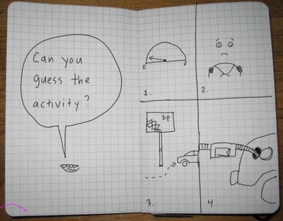
Visual thinking practice: Simplify and visualize a task

Visual thinking is the practice of using pictures to enhance your ability to solve problems, think about complex issues and communicate effectively. Are you ready to work on your visual thinking skills? You don't have to be an artist. Pick up a pen or pencil and try the following exercise.

1. Write down a list of the steps involved in a complex everyday task, such as grocery shopping, or doing laundry.

2. Try to combine your list of steps or actions into four main categories.

3. Divide a page into four sections.

4. In each section, draw an item or simple scene that that represents that activity (for example, a grocery bag or shopping cart, folding laundry, etc).

The test for success on this exercise is to ask a friend to guess what task you chose by looking at your drawings.

Thanks to the creative team at XPLANE for this great exercise!

07 December 2005

Know your audience

Here's what happens when you try too hard to be hip with your marketing:

Sony tried to get the attention of gamers by hiring graffiti artists to promote their agenda (it backfired).

Don't make the same mistake.

1. Understand your audience.
2. Convey information that is relevant and important to them.
3. Make it easy for them to quickly understand.
4. Don't push yourself on them. Instead, make it easy for them to come to you.

Photo by Ryan Singel for Wired News.

Scheduling by email

Here's a clever trick to schedule group events by email, found via 43folders. All you need is to be sure everyone has access to email and a monospaced font like Courier.

06 December 2005

How do you get out of a rut?

Today's post is not an answer but a question: When you are stuck in a rut, how do you get out of it?

[Update: Read the comments to this post -- a lot of great ideas there.]

Seven C's of communication design

Do you design your communications or do they just kind of happen? When your communication is important -- that is, when you want it to be remembered -- you need to think carefully and design it to resonate with your intended audience.

Designing your communication is an iterative process. It begins at a high level, with good questions and good listening; and ends in details; constructing a presentation, document, system or user experience.

You can improve your communication by thinking about seven "C's" of communication design: The seven C's lay out a simple sequence which can help you start broadly and work your way down to specifics.

Here are the seven C's, in order:

1. Context.
What's going on? Do you understand the situation? Is there a dead elephant in the middle of the room that you're not aware of? Ask good questions. You'll need a clear goal before you begin to design any communication. Ask: who are you talking to and what do you want them to do?

2. Content.
Based on your goal, define a single question that your communication is designed to answer. This is the best possible measure of communication effectiveness. What do you want your audience to walk away with and remember? Once you have defined your prime question, set out to answer it. What information is required? Do you have the answer already, or do you need to search it out?

3. Components.
Before you build anything, break down your content into basic "building blocks" of content. Formulate the information into clusters and groups. What patterns emerge? How can you make the information more modular? Given your goal, what is the most fundamental unit of information? You can use index cards to break down information into modules.

4. Cuts.
This is one of the hardest parts of the process and most often neglected. People's attention will quickly drift -- they expect you to get to the point. Learn to edit. Kill your little darlings.

5. Composition.
Now it's time to design the way you will tell your story. Think in terms of both written and visual composition. When writing; who are your main characters? How will you set up the scene? What are the goals and conflicts that will develop? How will the story reach resolution? In visual terms; where will the reader begin? How will you lead the eye around the page? In all your compositional thinking; how will you engage your audience? How will you keep them engaged? Writing it down forces you to think it through.

6. Contrast.
What are the differences that matter? Use contrast to highlight them: Big vs. little; rough vs. smooth; black vs. white. When making any point, ask, "in comparison with what?" Contrast is a trigger to the brain that says "pay attention!"

7. Consistency.
Unless you're highlighting differences, keep things like color, fonts, spacing and type sizes consistent to avoid distracting people. Research shows that any extraneous information will detract from people's ability to assimilate and learn.

Rethinking the London underground map

Oskar Karlin, a student at Stockholm University, decided to redesign the famous London Underground map -- with an interesting twist: time.

He explains his thought process:

"I started thinking; what's different in the world now than when the map was designed? One thing that's different today is time. No one has any time left any more. Time is money. Time is everything and so on.

Today you never tell anyone how far away in miles you live, but in minutes, or perhaps hours if you're unlucky. So I decided to create a re-design based on time instead of distance (normal maps) or simplicity (tube maps). By combining geographically accuracy with simplicity and time, I started out with measuring the time it takes to travel between each station in the whole system..."

Oskar shares more of his thinking process here.

04 December 2005

Visual thinking practice: Icons

Visual thinking is the practice of using pictures to enhance your ability to solve problems, think about complex issues and communicate effectively. Are you ready to work on your visual thinking skills? You don't have to be an artist. Pick up a pen or pencil and try the following exercise.

1. Make a list of common objects; things you see on a daily basis. Here are a few ideas: Camera, shoe, glass of water.

2. Divide a page into 12 squares. Label each square with the name of an object from your list. If you've got the Moleskine gridded notebook you can grid out your pages as shown here.

3. Now see if you can draw a simple icon that represents each object. This is not a drawing exercise and much as a simplification exercise. Imagine you are designing a computer desktop icon and try to use the fewest lines possible to represent the object.

This is a great way to hone your ability to distill the core meaning of objects and ideas into simple visuals. When you become comfortable with everyday objects you can move on to more difficult subjects, like actions, ideas and emotions.

If you liked this post you might also like:
Visual thinking practice: Expressing emotion
Visual thinking practice: Turning words into pictures
Visual thinking practice: Your life as a book

Send me your experiments and I'll post them for others to see.

03 December 2005

Separating presentation fact from fiction

"Presentation Facts is a work in progress. It is an ongoing search for empirical evidence of effectiveness in various presentation related arenas. As I have read through studies on the persuasive effect of various types of visual support, an interesting pattern seems to be emerging relative to the use of animations in computer graphic presentations."

Read more in Presentation Facts.

02 December 2005

The principles of the world cafe

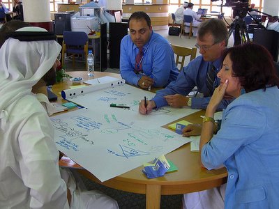
The world cafe is an alternative to "preacher" presentation mode. Here are its primary principles:

* Clarify the context
* Create hospitable space
* Explore questions that matter
* Connect diverse perspectives
* Encourage each person's contribution
* Listen together for patterns, insights and deeper questions
* Share collective discoveries

Read more in Welcome to The World Cafe.

The PR submarine

The Submarine:

"One of the most surprising things I discovered during my brief business career was the existence of the PR industry, lurking like a huge, quiet submarine beneath the news. Of the stories you read in traditional media that aren't about politics, crimes, or disasters, more than half probably come from PR firms."

IBM is podcasting

From Trafcom News: IBM now sipping the internal podcast Kool-Aid:

"IBM is podcasting internally.

One example cited in an article in InfoWorld is a weekly status update from IBM's supply chain organization. The group used to run a traditional conference call with as many as 7,000 people. Now, supply-chain executives upload a weekly podcast so staffers can listen when they want. It's less costly and more convenient for employees."

I need to get with the podcasting program. Thanks Idea Grove!

01 December 2005

Little Things Add Up

Little Things Add Up. For Example, if You Write Your Headlines in "Title Case," It Slows Down Your Reader. So Why Do It In The Title? Forget What You Learned In School: If You Look At Most Newspapers And Magazines, They Don't Do It Anymore. Reader Attention Is Too Valuable to Slow Down, Even for the Second or Two It Takes to Read Title Case.

How to think clearly

In I can think clearly now, Luda Kopeikina points out that the path to clarity lies in improving your physical and mental state; you think better and make better decisions when you are:
- Physically relaxed;
- Emotionally positive, happy, and released from fear and anxiety;
- Charged with power, success, self-confidence, and energy;
- Totally in the present;
- Mentally focused on the task at hand.

Kopeikina identifies three bad habits (often masquerading as positive traits) that can cloud your thinking and decision making. She also offers alternatives that can improve your clarity of mind:

Bad Habit #1: Multitasking
In most business positions, multitasking is considered an essential skill. The problem with multitasking is that you never completely focus on anything.

Alternative: Do tasks consecutively
Concentrate fully on one item before moving onto the next. By concentrating solely on one item, you will be able to get through your to-do list more quickly than if your attention is scattered.

Bad Habit #2: Being Competitive with Others
You have no control over how smart or ambitious or connected someone else is, so don’t waste your energy focusing on it.

Alternative: Compete only with yourself.
Push yourself to excel at your job, learn new skills, and develop new talents. Do your research, brush up on your knowledge, and invest your time in self-improvement — not worrying about your competition.

Bad Habit #3: Working Constantly
Through technology, we are better connected to our jobs now than ever before. Our work is with us all the time. Cell phones, pagers and laptops make it all too easy to work when we shouldn’t be.

Alternative: Make time to regenerate
You need to save some mental, physical, and emotional resources to regenerate, think, and strategize for the future. Make yourself unavailable as often as you can. Resist the urge to “just check email” five times a day when you’re on vacation. Let your phone calls go into voice mail.

Read more.

30 November 2005

It's time to move away from presentation mode

Presentations need an overhaul. I don't mean your PowerPoint or your presentation style; I mean our cultural approach to presenting. We need to take another look at it.

Question: What is the purpose of the presentation?

The overt purpose is to educate and inform

The covert purpose is to reinforce the status of the expert and remind the audience that they are not competent to solve their own problems.

I submit that in the information age the traditional presentation model needs to change from

presenter>audience to

host<>guests.

Ideas don't evolve in a vaccuum and they don't generally flow in one direction.

Our current paradigm is based on a preacher model. An authority figure stands at the front of the room and lectures the class for forty minutes and then takes questions from the audience. Presentation styles vary but more or less they all follow this model.

Nearly every one of XPLANE's customers already has the expertise they need to solve their problems. They don't need more experts in the traditional sense -- they need people who can help them find, develop and share the best practices and experts within their own organizations. They don't need more wizards and consultants; they need to improve their communication flows.

We need fewer presentations and more conversations.

We need to develop new approaches that allow the group to take on a greater role in the knowledge-sharing experience. Approaches that turn the traditional presenter into the host of a knowledge-sharing event, rather than an expert spouting wisdom.

At XPLANE, we are working on some experiments in conversation, in an attempt to flesh out some new mechanisms for unleashing the knowledge and creativity of groups. We have already identified some interesting patterns and structures that have lead to powerful results. If your organization would like to host one, please let me know and we can try to design one together.

Please share your thoughts.