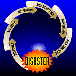
 Jon Stewart of the Daily Show points out the problem with this chart from FEMA. When disasters happen, FEMA's approach is
- Response
- Recovery
- Mitigation
- Risk reduction
- Prevention
- Preparedness
LEADING BACK TO DISASTER AGAIN!
The underlying visual structure of your charts is important. Before you make a chart, think about what its composition might imply to your audience.
Thanks to Andrew Crowley for the link.
Keep in touch! Sign up to get updates and occasional emails from me.
2 comments:
Microsoft is going to enable millions of Powerpoint users to make charts just like that in their new release.
Interesting. What kind of software is that and what do you make of it?
Post a Comment