The org chart is a useful tool: it’s a visual way to represent the chain of command and in large, complex organizations it can be helpful. The bigger the company, the more it can help you navigate.
But most of the time, nobody ever looks at it the org chart. When it comes to their daily lives, the org chart is irrelevant.
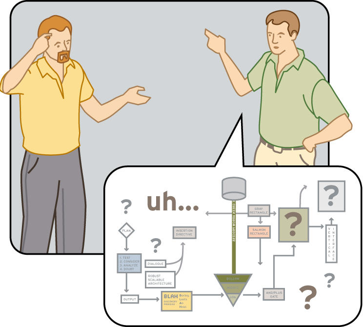
It’s the same with flow charts and process maps: they’re helpful to define things; as thinking and planning tools; but far too often, people try to use them to communicate.
Communication is a task for which many charts and process maps are woefully unsuited.
People don’t like to think of their role in the organization as a name in a box, lost in rows and columns of identical boxes. They don’t like to think of their jobs as diamonds, boxes, lines and arrows.
People think of their roles as important links in a chain that delivers value to customers. They think of their jobs as interactions between people that help drive that value: teamwork, decisions, action, results.
Org charts and process maps can be clear if people invest the time to read them, but most of the time they don’t, because the very format the information takes is dehumanizing.
Next time you want to convey a process, or discuss people’s roles and accountabilities, think about visualizing what’s really important to them instead of drawing boxes and lines. Your people will appreciate it, you’ll see more “light bulbs” go on, and in the end you’ll see better results.
Keep in touch! Sign up to get updates and occasional emails from me.
7 comments:
I have a contrarian view. Maybe it's not actually 'read', but certainly actively watched.
In my experience, the org chart is the most watched document in the company. People devote lots of tiem to analysing changes to the org chart in order to understand the shifting political landscape and power bases inside corporations.
This means that creating an org chart is one of the emotionally-charged activities a team leader can engage in.
R.
Hey,
Truly Awesome Blog. I wonder who does the fine artwork for your blogs?
-Rajhesh
http://spaces.msn.com/members/random-walks
Richard,
I fully agree that creating an org chart can be politically charged and that it is sometimes actively watched. But do you think this is a sign of a productive organization?
Rajhesh. The artwork is mostly by my company, XPLANE: http://xplane.com
I think Organisation Charts can be incredibly effective in any organisation regardless of size, even if it is just to remind people that they are part of a bigger picture.
One of the most common errors is that the organisational chart is hidden in a file that nobody remembers.
But it is all in the presentation,
I do some volunteer work in a organisation, they have an organisational chart right at the front of the building with everyones photo on it - and they are pretty funky photo's - it makes it so welcoming because I can easily see what everybody does.
Graeme,
What a wonderful way to make the org chart relevant and even warm.
This way of making an org chart welcoming and inviting is a wonderful concept.
My experience pretty much matches richard. However, in many organizations it takes so long to obtain the approvals for a formal organization chart change that the chart is a bit out of date by the time it is published.
A little off topic but the most striking thing about the Microsoft org chart is that I think I can count the names of every single female on that chart with just two hands.
-a gentleman
Post a Comment